Although the draft work programmes for the EC's new Framework Programme, Horizon Europe, are being leaked and the Portugese presidency is making it a priority to get things moving on it, the main question has yet to be answered: what's the logo for it, and how does it compare to previous iterations? Fortunately, fearless Fundermentals is here to help.
Before looking at the new proto-logo, we need to take a step back and look at where it all began. In the beginning was the word, and many, many of them - and certainly no logos. Framework Programmes 1-4 (1984-98) had none.14 years without a logo! What the hell were they thinking?
Luckily they saw the importance of image and, with the launch of FP5 in 1998 they got the Mad Men to design a graphic that summed up the core values of the programme. Unfortunately, the Mad Men seem to have been watching the Blair Witch Project at the time.
The similarities are unsettling.
The geometry of the background, too, is suggestive of pentangles, upside-down crosses and racks. It was like some kind of warning: enter at your peril. This was entirely intentional and excellent advice for anyone considering European funding.
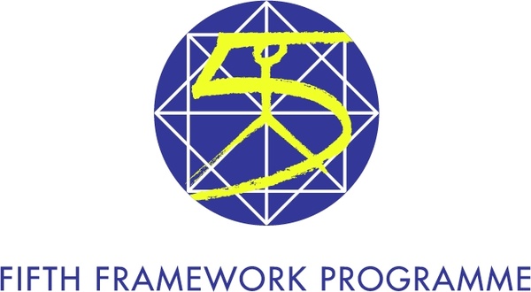
By 2002 things had calmed down somewhat in DG Research. By then they were still quite excited by the opportunities offered by Windows 95 and the Internets. They had a dial-up modem and everything. So FP6 has the grey/blue colour palate that screams early Microsoft, and brings me out in hives at the thought of talking paperclips.
It's like the pinstriped brother of Internet Explorer 6.
By 2007 DG Research realised it needed to up its game. For FP7 it hit the sweetspot of logodom.
Okay, so there are only five lines not seven, but don't take it so literally, man. This is the acme of FP logos: simple, clear, and not reliant on ClipArt or found-footage films. So there's a little bit of mid-1970s
Superstars, but that can only be a good thing, right?
And then, and then the shark was jumped. With Horizon 2020 they went full-on 2001: A Space Odyssey.
Like some kind of Event Horizon, it suggested that something was happening that was big, cataclysmic, and you didn't really want to go anywhere near it.
'Infinite terror'. Once again, like Blair Witch, the ad executives were doing all they could to try and prevent people from having anything to do with European funding. How explicit did you want them to be?
And so to Horizon Europe. It's been a long journey, and we've explored horror, scifi, ClipArt and 70s TV sports competitions. And where have we ended up?
Well, it looks like some kind of children's TV mashup. Is that some kind of wood texturing behind it all? And the rocket? Really? Tintin would be proud. All of it appears to be like some kind of thought bubble, like it's reflecting what's going on in an ad executive's head when someone says the word 'science'.
Humanities and social sciences don't feature very highly (or at all) here, but at least there's nothing supernatural either. Unless the faceless cyborg at the top is coming to kill us with its 'Science'.
So the results are a mixed bag, but the overall message is, I think, positive: 'look at us,' DG Research is saying. 'We've not wasted any money on paying designers. Trust us: we won't waste your taxpayers' money on anything - except very, very long application forms.'


No comments:
Post a Comment